RBSE Class 6 Maths Chapter 4 Data Handling and Presentation Solutions
PracticingRBSE Class 6 Maths Solutionsand Class 6 Maths Chapter 4 Data Handling and Presentation Solutions Question Answer helps develop logical thinking and accuracy.
Data Handling and Presentation Class 6 Solutions
Ganita Prakash Class 6 Chapter 4 Solutions Data Handling and Presentation
Figure it Out (Page 75)
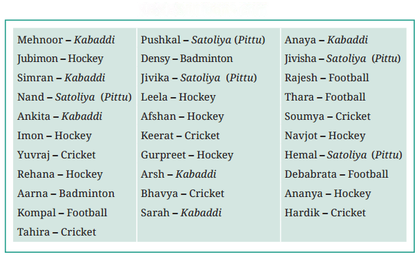
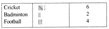
Naresh and Navya decided to go to each student in the class and ask what their favourite game is? Then they prepared a list.
Navya is showing the list :
Question 1.
What would you do to find the most popular game among Naresh’s and Navya’s classmates?
Solution:
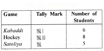
Using tally marks we can find out the most popular game among the classmates of Naresh and Navya.
Question 2.
What is the most popular game in their class?
Solution:
Hockey.
Question 3.
Try to find out the most popular game among your classmates.
Solution:
Do yourself.
Question 4.
Pari wants to respond to the questions given below. Put a tick (✓) for the questions where she needs to carry out data collection and put a cross (✗) for the questions where she doesn’t need to collect data. Discuss your answers in the classroom.
(a) What is the most popular TV show among her classmates?
(b) When did India get independence?
(c) How much water is getting wasted in her locality?
(d) What is the capital of India?
Solution:
(a) ✓
(b) ✗
(c) ✓
(d) ✗


Figure it Out (Page 76)
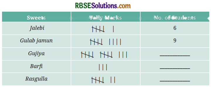
Shri Nilesh is a teacher. He decided to bring sweets to the class to celebrate the new year. The sweets shop nearby has jalebi, gulab jamun, gujiya, barfl and rasgulla. He wanted to know the choices of the children. He wrote the names of the sweets on the board and asked each child to tell him their preference. He put a tally mark ‘|’ for each student and when the count reached 5, he put a line through the previous four and marked it as.
Question 1.
Complete the table to help Shri Nilesh to purchase the correct numbers of sweets:
(a) How many students chose jalebi?
(b) Barfi was chosen bystudents?
(c) How many students chose gujiya?
(d) Rasgulla was chosen bystudents?
(e) How many students chose gulab jamun?
Solution:
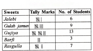
(a) 6
(b) 3
(c) 13
(d) 7
(e) 9






Question 2.
Is the above table sufficient to distribute each type of sweet to the correct student? Explain. If it is not sufficient, what is the alternative?
Solution:
No, the above table is insufficient to distribute each type of sweet to the correct student. Shri Nilesh should write the name of the sweet in front of each child’s name. Only then will he be able to give the right sweet to each child.
Figure it Out (Page 77)
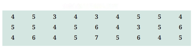
Sushri Sandhya asked her students about the sizes of the shoes they wear. She noted the data on the board.
She then arranged the shoe sizes of the students in ascending order —
3, 3, 3, 4, 4, 4, 4, 4, 4, 4, 4, 4, 5, 5, 5, 5, 5, 5, 5, 5, 5, 5, 6, 6, 6, 6, 7
Question 1.
Help her to figure out the following —
(a) The largest shoe size in the class is _____________ .
(b) The smallest shoe size in the class is _____________ .
(c) There are _____________ students who wear shoe size 5.
(d) There are _____________ students who wear shoe sizes larger than 4.
Solution:
(a) 7
(b) 3
(c) 10
(d) 15
Question 2.
How did arranging the data in ascending order help to answer these questions?
Solution:
Arranging the data in ascending order help in doing the calculations quickly.
Question 3.
Are there other ways to arrange the data?
Solution:
Yes, we can also arrange the data in frequency table or in descending order.
Question 4.
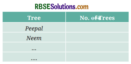
Write the names of a few trees you see around you. When you observe a tree on the way from your home to school (or while walking from one place to another place), record the data and fill in the following table:
a. Which tree was found in the greatest number?
b. Which tree was found in the smallest number?
c. Were there any two trees found in the same numbers?
Solution:
Do yourself
Question 5.
Take a blank piece of paper and paste any small news item from a newspaper. Each student may use a different article. Now, prepare a table on the piece of paper as given below. Count the number of each of the letters ‘c’, ‘e’, ‘i’, ‘r’, and ‘x’ in the words of the news article, and fill in the table.
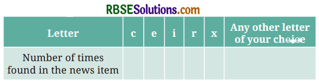
a. The letter found the most number of times is _____________ .
b. The letter found the least number of times is _____________ .
c. List the five letters ‘c’, ‘e’, ‘i’, ‘r’, ‘x’ in ascending order of frequency. Now, compare the order of your list with that of your classmates. Is your order the same or nearly the same as theirs? (Almost everyone is likely to get the order ‘x, c, r, i, e’.) Why do you think this is the case?
d. Write the process you followed to complete this task.
e. Discuss with your friends the processes they followed.
f. If you do this task with another news item, what process would you follow?
Solution:
Do yourself
Figure it Out (page 83)
Question 1.
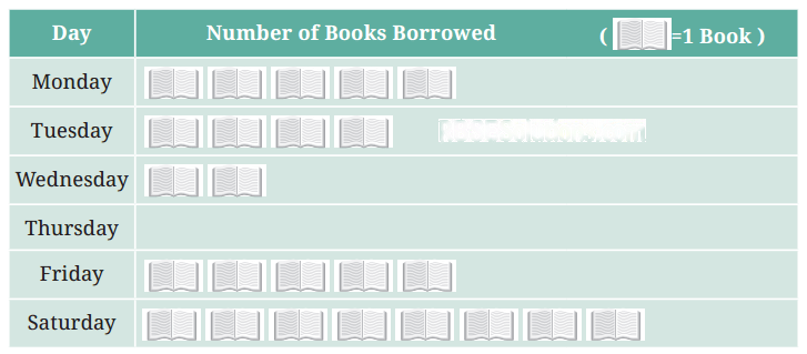
The following pictograph shows the number of books borrowed by students, in a week, from the library of Middle School, Ginnori —
(a) On which day were the minimum number of books borrowed?
(b) What was the total number of books borrowed during the week?
(c) On which day were the maximum number of books borrowed? What may be the possible reason?
Solution:
(a) Thursday
(b) Total books = 5 + 4 + 2 + 0 + 5 + 8 = 24 books
(c) Saturday
The possible reason for borrowing maximum number of books on Saturday could be that the next day is Sunday which is a holiday and students may get more time to read on that day.
Question 2.
Magan Bhai sells kites at Jamnagar. Six shopkeepers from nearby villages come to purchase kites from him. The number of kites he sold to these six shopkeepers are given below —
Prepare a pictograph using the symbolto represent 100 kites.
Answer the following questions :
(a) How many symbols represent the kites that Rani purchased?
(b) Who purchased the maximum number of kites?
(c) Who purchased more kites, Jasmeet or Chaman?
(d) Rukhsana says Poonam Ben purchased more than double the number of kites that Rani pur-chased. Is she correct? Why?
Solution:
Pictograph :
(a) 3 symbols
(b) Poonam Ben
(c) Jasmeet
(d) Yes, because Rani bought 300 kites and Poonam Ben bought 700 kites which is more than twice the number of 300.
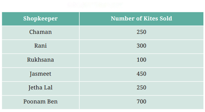

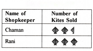
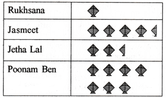
Figure it Out (Page 88)
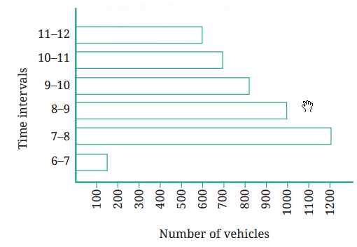
Let us look at an example of vehicular traffic at a busy road crossing in Delhi, which was studied by the traffic police on a particular day. The number of vehicles passing through the crossing each hour from 6 a.m. to 12:00 noon is shown in the bar graph. One unit of length stands for 100 vehicles.
Question 1.
How many total cars passed through the crossing between 6 a.m. and noon?
Solution:
Total cars passed through the crossing between 6 a.m. and noon
= 150 + 1200 + 1000 + 800 + 700 + 600 = 4450 cars
Question 2.
Why do you think so little traffic occurred during the hour of 6 – 7 a.m., as compared to the other hours from 7 a.m.-noon?
Solution:
The number of office goers is less during 6 a.m. to 7 a.m., hence the traffic is less during 6 to 7 a.m. as compared to other hours between 7 a.m. to 12 noon.
Question 3.
Why do you think the traffic was the heaviest between 7-8 a.m.?
Solution:
7-8 a.m. is the hour when the maximum number of factor)’ officers and other employees use their vechicles to drop their children to school.
Question 4.
Why do you think the traffic was lesser and lesser each hour after 8 a.m. all the way until noon?
Solution:
Do yourself.
Figure it Out (Page 93)
Question 1.
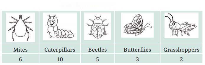
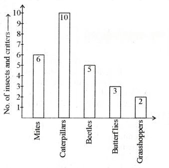
Samantha visited a tea garden and collected data of the insects and critters she saw there. Here is the data she collected —
Help her prepare a bar graph representing this data.
Solution:
She used this data and prepared a bar graph on the board to discuss the data with her
Question 2.
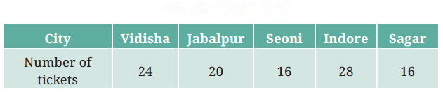
Pooja collected data on the number of tickets sold at the Bhopal railway station for a few different cities of Madhya Pradesh over a two-hour period.
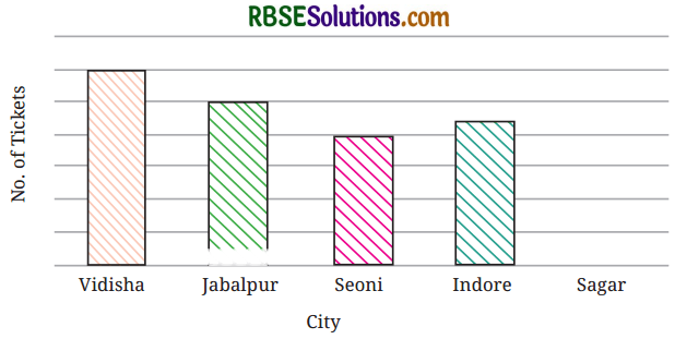
She used this data and prepared a bar graph on the board to discuss the data with her students, but someone erased a portion of the graph.
(a) Write the number of tickets sold for Vidisha above the bar.
(b) Write the number of tickets sold for Jabalpur above the bar.
(c) The bar for Vidisha is 6 unit lengths and the bar Jabalpur is 5 unit lengths. What is the scale for this graph?
(d) Draw the correct bar for Sagar.
(e) Add the scale of the bar graph by placing the correct numbers on the vertical axis.
(f) Are the bars for Seoni and Indore correct in this graph? If not, draw the correct bar(s).
Solution:
(a) 24 tickets
(b) 20 tickets
(c) 1 unit length = 4 tickets
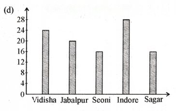
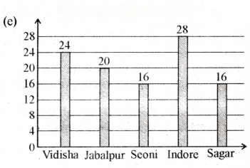
(f) No, the correct bars are shown in (d) and (e).
Question 3.
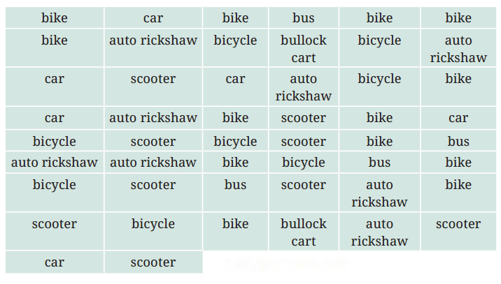
Chinu listed the various means of transport that passed across the road in front of his house from 9 a.m. to 10 a.m. :
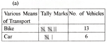
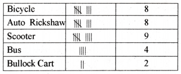
(a) Prepare a frequency distribution table for the data.
(b) Which means of transport was used the most?
(c) If you were there to collect this data, how could you do it? Write the steps or process.
Solution:
(b) Bike
(c) We would have collected the data using the same procedure as in (a).
Question 4.
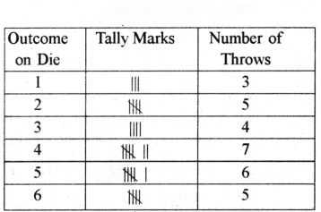
Roll a die 30 times and record the number you obtain each time. Prepare a frequency distribution table using tally marks. Find the number that appeared :
(a) The minimum number of times.
(b) The maximum number of times.
(c) Find numbers that appeared an equal number of times.
Solution:
Let the outcomes obtained by throwing a die 30 times be as follows :
(a) 1
(b) 4
(a) 2 and 6
Question 5.
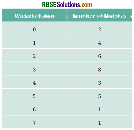
Faiz prepared a frequency distribution table of data on the number of wickets taken by Jaspreet Bumrah in his last 30 matches :
(a) What information is this table giving?
(b) What may be the title of this table?
(c) What caught your attention in this table?
(d) In how many matches has Bumrah taken 4 wickets?
(e) Mayank says, “If we want to know the total number of wickets he has taken in his last 30 matches, we have to add the numbers 0, 1, 2, 3 …, up to 7.” Can Mayank get the total number of wickets taken in this way? Why?
(f) How would you correctly figure out the total number of wickets taken by Bumrah in his last 30 matches, using this table?
Solution:
(a) This table is a frequency distribution table of the wickets taken by Jaspreet Bumrah in his last 30 matches in which he has taken wickets from 0 to 7.
(b) Bowling performance of Jaspreet Bumrah.
(c) Jaspreet Bumrah took three or more wickets in most matches.
(d) 3 matches
(e) No, because for getting, the total number of wickets, we multiply the wickets by match for each, then add to all.
(f) Total wickets = (0 × 2) + (1 × 4) + (2 × 6) + (3 × 8) + (4 × 3) + (5 × 5) + (6 × 1) + (7 × 1)
= 0 + 4 + 12 + 24 + 12 + 25 + 6 + 7 = 90
Question 6.
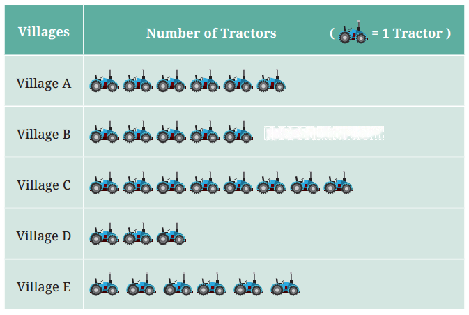
The following pictograph shows the number of tractors in five different villages.
Observe the pictograph and answer the following questions—
(a) Which village has the smallest number of tractors?
(b) Which village has the most tractors?
(c) How many more tractors does Village C have than Village B?
(d) Komal says, “Village D has half the number of tractors as Village E.” Is she right?
Solution:
(a) Village D
(b) Village C
(c) 3
(d) Yes
Question 7.
The number of girl students in each class of a school is depicted by the pictograph :
Observe this pictograph and answer the following questions :
(a) Which class has the least number of girl students?
(b) What is the difference between the number of girls in Class 5 and 6?
(c) If 2 more girls were admitted in Class 2, how would the graph change?
(d) How many girls are there in Class 7?
Solution:
(a) Class 8
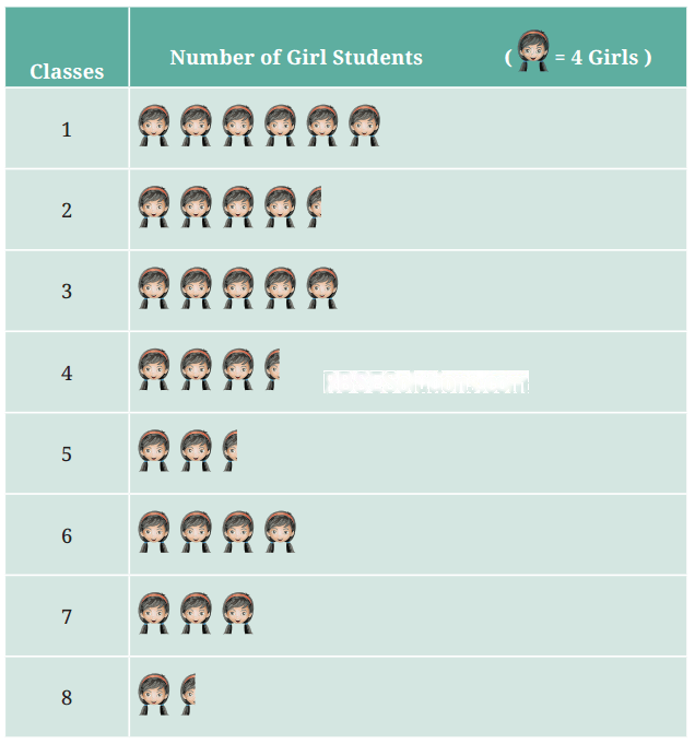
(b) Number of girls in class 6 = 4 × 4 = 16
Number of girls in class 5 = 4 × 2.5 = 10
Difference = 16 – 10 = 6
(c) 5 complete symbols of girls.
(d) 3 × 4 = 12 girls.
Question 8.
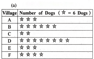
Mudhol Hounds (a type of breed of Indian dogs) are largely found in North Karnataka’s Bagalkote and Vijaypura districts. The government took an initiative to protect this breed by providing support to those who adopted these dogs. Due to this initiative, the number of these dogs increased. The number of Mudhol dogs in six villages of Karnataka are as follows — Village A : 18, Village B : 36, Milage C : 12, Village D : 48, Village E : 18, Village F : 24 Prepare a pictograph and answer the following questions :
(a) What will be a useful scale or key to draw this pictograph?
(b) How many symbols will you use to represent the dogs in Village B?
(c) Kamini said that the number of these dogs in Village B and Village D together will be more than the number of these dogs in the other 4 villages. Is she right? Give reasons for your response.
Solution:
(b) 6 symbols
(c) Yes
Total dogs in village B = 6 × 6 = 36
Total dogs in village D = 8 × 6 = 48
Total dogs in village B and village D = 36 + 48 = 84
Dogs in remaining villages A, C, E and F = 18 + 12 + 18 + 24 = 72
So, Kamini is right.
Question 9.
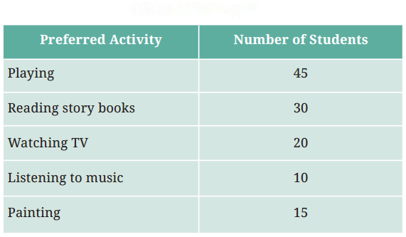
A survey of 120 school students was conducted to find out which activity they preferred to do in their free time :
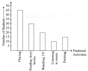
Draw a bar graph to illustrate the above data taking the scale of 1 unit length = 5 students. Which activity is preferred by most students other than playing?
Solution:
Reading story books is prefessed by most students other than playing.
Question 10.
Students and teachers of a primary school decided to plant tree saplings in the school campus and in the surrounding village during the first week of July. Details of the saplings they planted are as follows —
(a) The total number of saplings planted on Wednesday and Thursday is ____________ .
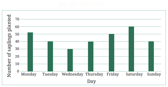
(b) The total number of saplings planted during the whole week is _______________ .
(c) The greatest number of saplings were planted on ___________ and the least number of saplings were planted on _______________ .
Why do you think that is the case? Why were more saplings planted on certain days of the week and less on others? Can you think of possible explanations or reasons? How could you try and figure out whether your explanations are correct?
Solution:
(a) 30 + 40 = 70
(b) 52 + 40 + 30 + 40+ 50 + 60 + 40 = 312 plants
(c) Saturday, Wednesday
The reason for more saplings being planted on certain days (like Saturday) could be that weekend provide more free time for students and teachers, leading to higher participation. On weekdays, school schedules and other commitments may limit the number of saplings planted.
Question 11.
The number of tigers in India went down drastically between 1900 and 1970. Project Tiger was launched in 1973 to track and protect the tigers in India. Starting in 2006, the exact number of tigers in India was tracked. Shagufta and Divya looked up information about the number of tigers in India between 2006 and 2022 in four-year intervals. They prepared a frequency table for this data and a bar graph to present this data, but there are a few mistakes in the graph. Can you find those mistakes and fix them?
Solution:
Yes, there are few mistakes in the graph.
(a) The number of tigers in 2006 is 1400 but it is shown less in the graph.
(b) The number of tigers in 2014 is 2200 but it is shown more in the graph.
(c) The number of tigers in 2018 is 3000 but it is shown less in the graph.
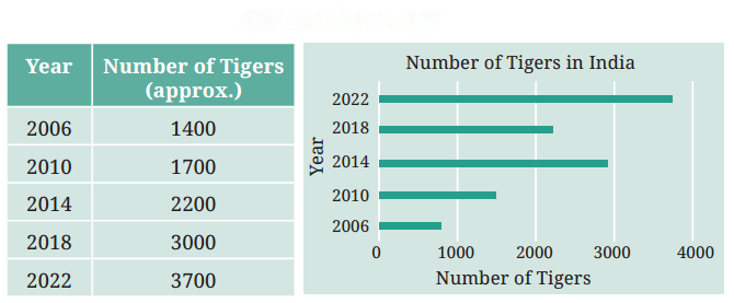
Figure it Out (Page 103)
Question 1.
If you wanted to visually represent the data of the heights of the tallest persons in each class in your school, would you use a graph with vertical bars or horizontal bars? Why?
Solution:
In this case, we would like to use a graph with vertical bars because a graph with vertical bars gives a clear representation and estimate of the heights of the tallest persons.
Question 2.
If you were making a table of the longest rivers on each continent and their lengths, would you prefer to use a bar graph with vertical bars or with horizontal bars? Why? Try finding out this information, and then make the corresponding table and bar graph! Which continents have the longest rivers?
Solution:
[Do yourself]
Data Handling and Presentation Class 6 Question Answer
Data Handling and Presentation Class 6 Extra Questions
Multiple Choice Questions—
Question 1.
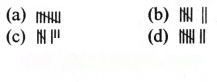
The tally symbol for number 7 will be—
Answer:

Question 2.
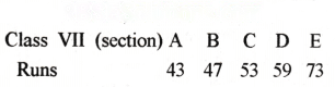
The students of class VII scored the following runs in a cricket match:
Which section scored the most runs?
(a) B
(b) C
(c) E
(d) D
Answer:
(c) E
Question 3.
What number do tally signsrepresent?
(a) 2
(b) 3
(c) 7
(d) 8
Answer:
(d) 8

Question 4.
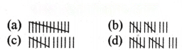
The tally symbol for number 13 will be—
Answer:

Question 5.
In a factory, the monthly salaries of the workers are as follows:
Monthly salaries | No. of workers |
5000 | 15 |
7000 | 12 |
9000 | 10 |
12000 | 05 |
15000 | 03 |
20000 | 01 |
How many workers get the least salaries?
(a) 01
(b) 03
(c) 10
(d) 15
Answer:
(d) 15
Question 6.
What does the data mean?
(a) A collection of information
(b) A collection of numbers of facts on a subject
(c) A group of pictures
(d) A collection of stories
Answer:
(b) A collection of numbers of facts on a subject
Question 7.
What is the table used for?
(a) To collect the data
(b) To present the data in a systematic manner.
(c) To hide the data
(d) To delete the data
Answer:
(b) To present the data in a systematic manner.
Question 8.
How data is stored in a table?
(a) In different rows and columns
(b) In chart
(c) On different papers
(d) In just one line
Answer:
(a) In different rows and columns
Question 9.
Which element in a bar graph represents the height of the bar?
(a) Quantity
(b) Time
(c) Distance
(d) Length of bar
Answer:
(a) Quantity
Question 10.
which is the easiest way to present data?
(a) By using numbers
(b) By using pictures
(c) By using charts and graphs
(d) By using the rows
Answer:
(c) By using charts and graphs
Fill in the blanks—
1. ……………………… is a collection of numbers gathered to give some meaningful information.
Answer:
Data
2. Data can be made easily countable by preparing a ……………………… .
Answer:
table
3. ……………………… are used in the table to calculate.
Answer:
tally-marks
4. Data are ……………………… of numbers that are put together to give some information.
Answer:
collection
5. ……………………… can also be presented by using a bar graph.
Answer:
data
6. The presentation of information through pictures is called ……………………… .
Answer:
pictograph
7. A pictograph ……………………… data as pictures, objects or parts of objects.
Answer:
represents
Write True/False for the following statements—
1. Unequal distance between the bars in a bar graph indicates that they are free standing and representing similar categories. (True/False)
2. The data should be visually attractive and easy to understand so that the viewer can easily understand the information provided by it. (True/False)
3. The number of times of specific value, measurement or observation occurs is called its frequency. (True/False)
4. Choosing an appropriate scale for a pictograph or bar graph is not important. (True/False)
Answer:
1. False
2. True
3. True
4. False
Make the right match—
Question 1.
1. Table | (a) Representing a number by the height of a bar |
2. Bar graph | (b) A collection of numbers, facts, scales etc. that give information |
3. Pictograph | (c) Numerical information of data |
4. Data | (d) Representing data as pictures/objects |
5. Organization of data | (e) Arranging data in rows and columns |
Answer:
1 – (e), 2 – (a), 3 – (d), 4 – (b), 5 – (c)
1. Table | (e) Arranging data in rows and columns |
2. Bar graph | (a) Representing a number by the height of a bar |
3. Pictograph | (d) Representing data as pictures/objects |
4. Data | (b) A collection of numbers, facts, scales etc. that give information |
5. Organization of data | (c) Numerical information of data |
Very Short Answer Type Questions—
Question 1.
What are data?
Solution:
Data is a collection of observations, numbers and facts which carry information.
Question 2.
What is the meaning of frequency?
Solution:
Frequency means the number of times a particular value or event occurs.
Question 3.
What is a pictograph?
Solution:
Pictographs are a way of representing data through pictures.
Question 4.
What does the height of a bar in a bar graph mean?
Solution:
The height of the bar represents the quantity or value that is shown in the figure.
Question 5.
How bars are arranged in a bar graph?
Solution:
In a bar graph, the bars are arranged vertically or horizontally.
Question 6.
What is frequency used for?
Solution:
Frequency is used to understand the repetition of values in data.
Question 7.
What is the difference between a bar graph and a pictograph?
Solution:
In a bar graph the data is shown by the height of the bars while in a pictograph the data is shown by pictures or symbols.
Question 8.
What is the first thing to do when creating a frequency table?
Solution:
Firstly, a list of different values should be made and then their frequencies should be counted.
Question 9.
Why is the distance between the bars maintaned in a bar graph?
Solution:
The distance between the bars makes the difference between the different categories clearly visible.
Question 10.
Bar graph is more useful for presenting which type of information?
Solution:
Bar graph are useful for showing comparisons between different categories such as student’s favourite sports.
Short Answer Type Questions—
Question 1.
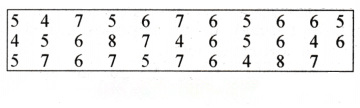
Yasha was asked to collect data about the shoe sizes of her class VI students. She shows her data below :
Himanshu wanted to know the following information—
(i) The size of shoes worn by maximum number of students.
(ii) The shoe size to be worn by minimum number of students.
Solution:
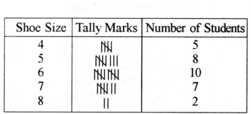
On preparing the table :
(i) The size of shoes worn by maximum number of students is 6.
(ii) The shoe size to be worn by minimum number of students is 8.
Question 2.
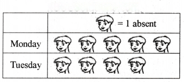
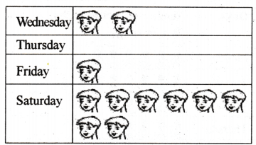
The number of students absent in a particular class of 30 students in the past week is shown in detail by the following pictograph.
(a) On which day most students were absent?
(b) On which day was the attendance full?
What was the total absentees in this week?
Solution:
(a) Saturday
(b) Thursday
(c) 20
Question 3.
The colours of fridges preferred by people living in a locality are shown by the following pictograph= 10:
(a) Find the number of people preferring blue colour.
(b) How many people liked red colour?
Solution:
(a) Blue colour is preferred by 50 people.
(= 10, so 5 pictures indicate 5 × 10 people).

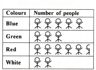

(b) Deciding the number of people liking red colour needs more care.
For 5 complete pictures, we get 5 × 10 = 50 people.
For the last incomplete picture, we may roughly take it as 5.
So, number of people preferring red colour is nearly 55.
Question 4.
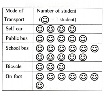
A survey was conducted in a school to find out which means of transport the students use to come to school every day. 30 students of class VI were interviewed and the data obtained was displayed in the form of a pictograph as follows :
What conclusions can you draw from this pictograph?
Solution:
(a) The number of students coming with self cars is 4.
(b) Most students travel by school bus, which is the most popular mode of transport.
(c) Only three students use bicycle.
(d) The number of students using other means can also be found in the same way.
Question 5.
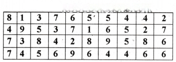
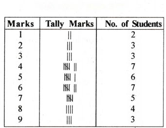
In a mathematics test, the following marks were obtained by 40 students. Arrange these marks in a table using tally marks.
(a) Find, how many students obtained marks equal to or more than 7?
(b) How many students obtained marks below 4?
Solution:
(a) Twelve students
(b) Eight students
Question 6.
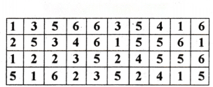
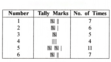
Catherine threw a dice 40 times and noted the number appearing each time as shown below :
Make a table and enter the data using tally marks. Find the number that appeared :
(a) The minimum number of times.
(b) The maximum number of times.
(c) Find those numbers that appear as an equal number of times.
Solution:
(a) The minimum number of times = 4
(b) The maximum number of times = 5
(c) 1 and 6.
Long Answer Type Questions—
Question 1.
The sale of electric bulbs on different days of a week is shown below :
Observe the pictograph and answer the following questions :
(a) How many bulbs were sold on Friday?
(b) On which day were the maximum number of bulbs sold?
(c) On which of the days same number of bulbs were sold?
(d) On which of the days minimum number of bulbs were sold?
(e) If one big carton can hold 9 bulbs. How many cartons were needed in the given week?
Solution:
(a) Number of bulbs sold on Friday are 7 × 2 = 14.
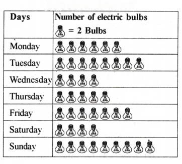
(b) Maximum number of bulbs (9 × 2 = 18) were sold on Sunday.
(c) Same number of bulbs (8) were sold on Wednesday and Saturday.
(d) The minimum number of bulbs (8) were sold on Wednesday and Saturday each.
(e) The total number of bulbs sold in the given week = (6 + 8 + 4 + 5 + 7 + 4 + 9) × 2 = 43 × 2 = 86.
So, the number of carton required to hold 86 bulbs = = 10
(∵ One big carton can hold bulbs = 9)
Hence, 10 cartons required to hold the bulbs.
Question 2.
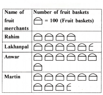
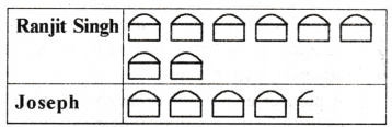
In a village six fruit merchants sold the following number of fruit baskets in a particular season :
Observe this pictograph and answer the following questions :
(a) Which merchant sold the maximum number of baskets?
(b) How many fruit baskets were sold by Anwar?
(c) The merchants who have sold 600 or more number of baskets are planning to buy a godown for the next season. Can you name them?
Solution:
(a) Martin
(b) 7 × 100 = 700 fruit baskets
(c) Anwar, Martin, Ranjit Singh.